The following are not always a must and, in most cases can be hidden in favor of more space for the chart and during C# editor development. They can be on as needed.
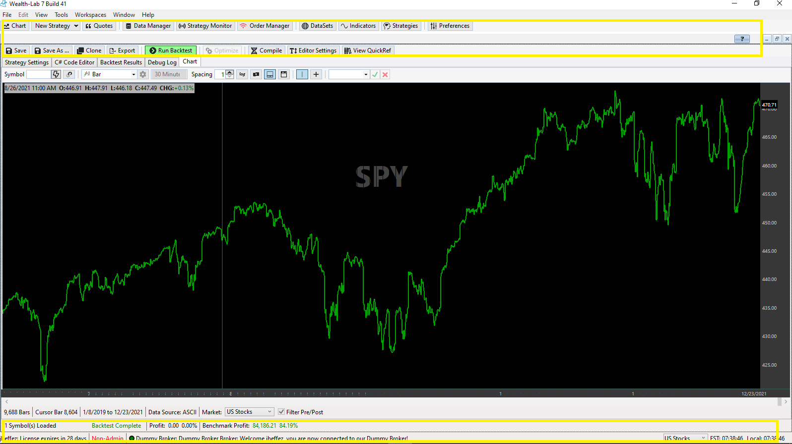
1. Top Toolbar with buttons: Chart, New Strategy, Quates, ...
2. Toolbar with buttons: Save, Save As, Clone, Export, ...
3. bottom status bar with time to market open
Is it possible to hide them?
If not, I'd like to suggest it as a new feature. Also, I'd like to suggest adding a hotkey to each of the above toolbar buttons for faster use.
Thanks!
Rename
We decided to not hide the top toolbar. From the View menu you can hide the left navigation panel / drawing toolbar. For everything else, right click on the chart and...
1. uncheck "Show status bar" to hide it
2. uncheck "Lock toolbar visibility" to capture more space. Once hidden, you can bring it back the same way or temporarily by mousing over the chart's top. Which is a neat feature.
Don't forget to choose "Expert mode" to condense more space.
1. uncheck "Show status bar" to hide it
2. uncheck "Lock toolbar visibility" to capture more space. Once hidden, you can bring it back the same way or temporarily by mousing over the chart's top. Which is a neat feature.
Don't forget to choose "Expert mode" to condense more space.
Yes, I hid toolbar visibility and status bar. There is still a big percentage of unused space that can be reclaimed.
Anything you can do for future updates is welcome!
Anything you can do for future updates is welcome!
What "big" percentage? I don't see any except perhaps the app's status bar.
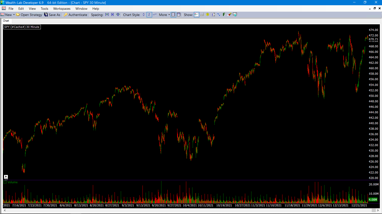
See attached. I'd say that's not a small percentage.
Compare it to

Compare it to

You're comparing apples to oranges. Enable all the space saving tweaks in WL7 and open a chart as you did in WL6 - not the Strategy window with all those mandatory tabs like Editor, Debug etc. and the status bar with important info that has to be displayed since this is a backtest.
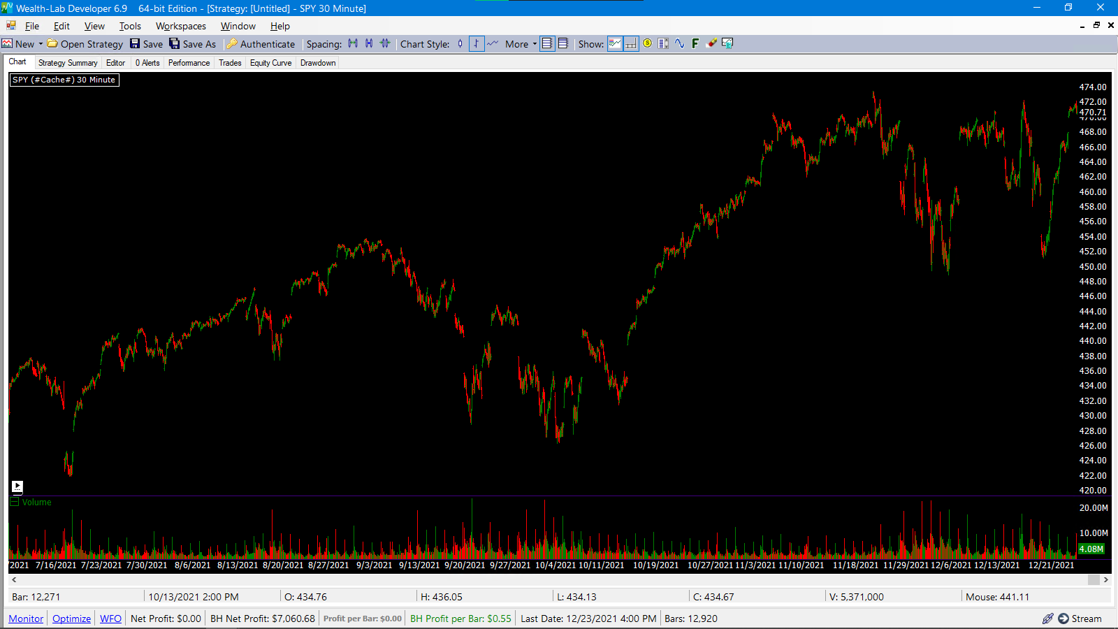
Here is a WL6 strategy screen. It still has better screen space.
The point is, I can hide the toolbars at will. That's the main point.
The point is, I can hide the toolbars at will. That's the main point.

I completely understand that WL7 is young and was built from the ground up. I'm sure that it will be better in every way possible than WL6 and that your feature "plate" work is long. I don't expect everything to be available. I'm just trying to nudge a bit. :)
I see one horizontal space of about 25 px tall where the F1 button and window controls reside. I'd like to optimize this as well but they probably cannot be condensed in the WL6 manner since aparently it's a WPF thing now. Dion, what do you think?
But for other highlighted areas that show how many symbols are loaded in the backtest, when your license expires, and if a provider has fired a failure notice that may affect your trading, isn't this important?
But for other highlighted areas that show how many symbols are loaded in the backtest, when your license expires, and if a provider has fired a failure notice that may affect your trading, isn't this important?
Eugene,
In the majority of the time, I don't need that info. I much prefer that space for other things. Please understand.
In the majority of the time, I don't need that info. I much prefer that space for other things. Please understand.
The top yellow box is out of our control. The bottom yellow box is showing the chart status bar that you can already hide if you want.
the only thing left is the main window status bar and we can provide a menu option to hide that.
the only thing left is the main window status bar and we can provide a menu option to hide that.
Your Response
Post
Edit Post
Login is required