I recently stumpeled upon a paper by H. Bessembinder from May 2018 with that same title: "Do Stocks Outperform Treasury Bills?"
(see https://www.zeninvestor.org/wp-content/uploads/2025/11/Do-stocks-outperform-T-bills.pdf?srsltid=AfmBOopUqvPjE0_h4E-tsMWZQSnWHeqUq8ynhrpLoZu0uDbZkDf6aOUK)
It starts with this text:
Mister Bessembinder than goes on and shows the following histogram:
How many stocks have a certain CAGR (this is APR in WealthLab speak)?
And produces graphs like the following:
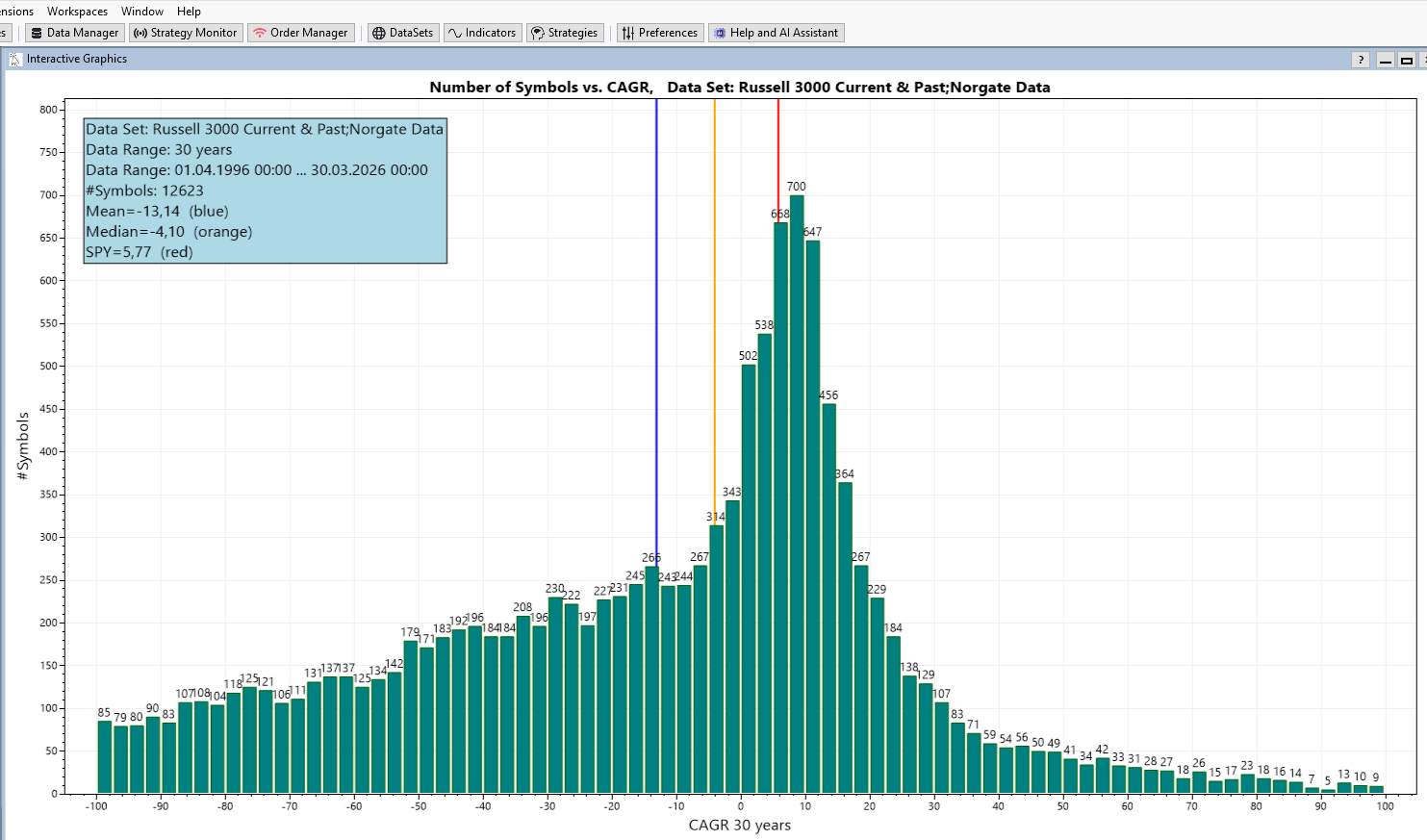
The graphic is generated with WealthLab and the finantic.InteractiveGraphics extension.
The data comes from the Russel 3000 Current & Past DataSet (provided by Norgate) and contains the last 30 years.
The X-Axis shows the CAGR values of individual stocks during the last 30 years.
The Y-Axis shows the number of stocks that had such a CAGR.
Here a few surprising details:
* the majority of Stocks have a negative CAGR during the last 30 years (Median < 0).
* the average CAGR of these stocks is negative during the last 30 years (Mean < 0)
* The benchmark (SPY) has a positive CAGR of 5,77% during the last 30 years (this is well known and expected)
Mr. Bessembinder offers these explanations:
* The distribution shown above is highly skewed. There are more stocks with negative CAGR than stocks with positive CAGR.
* Only a small number of stocks have a very high CAGR
* These successful stocks are responsible for the positive CAGR of the benchmark/index/overall stock market.
These findings have severe consequences:
* If you pick a selection of stocks (like any hedge fund manager) chances are you miss the top performers and stick with the losers.
* A trading startegy that runs on a subset of the overall market has the same problem.
(see https://www.zeninvestor.org/wp-content/uploads/2025/11/Do-stocks-outperform-T-bills.pdf?srsltid=AfmBOopUqvPjE0_h4E-tsMWZQSnWHeqUq8ynhrpLoZu0uDbZkDf6aOUK)
It starts with this text:
QUOTE:
The question posed in the title ... may seem nonsensical. The fact that stock markets provide long-term returns that exceed the returns to low risk investments ... has been extensively documented ...
In fact, the degree to which stock markets outperform is so large that there is wide spread reference to the "equity premium puzzle"
Mister Bessembinder than goes on and shows the following histogram:
How many stocks have a certain CAGR (this is APR in WealthLab speak)?
And produces graphs like the following:
The graphic is generated with WealthLab and the finantic.InteractiveGraphics extension.
The data comes from the Russel 3000 Current & Past DataSet (provided by Norgate) and contains the last 30 years.
The X-Axis shows the CAGR values of individual stocks during the last 30 years.
The Y-Axis shows the number of stocks that had such a CAGR.
Here a few surprising details:
* the majority of Stocks have a negative CAGR during the last 30 years (Median < 0).
* the average CAGR of these stocks is negative during the last 30 years (Mean < 0)
* The benchmark (SPY) has a positive CAGR of 5,77% during the last 30 years (this is well known and expected)
Mr. Bessembinder offers these explanations:
* The distribution shown above is highly skewed. There are more stocks with negative CAGR than stocks with positive CAGR.
* Only a small number of stocks have a very high CAGR
* These successful stocks are responsible for the positive CAGR of the benchmark/index/overall stock market.
These findings have severe consequences:
* If you pick a selection of stocks (like any hedge fund manager) chances are you miss the top performers and stick with the losers.
* A trading startegy that runs on a subset of the overall market has the same problem.
Rename
In case you ask yourself:
* how is such a plot possible in WealthLab?
* can I produce such a plot with my own data / settings?
I made a separate post: "Making of "#Symbols vs CAGR" Graphics
https://www.wealth-lab.com/Discussion/Making-of-quot-Symbols-vs-CAGR-quot-Graphics-13030
* how is such a plot possible in WealthLab?
* can I produce such a plot with my own data / settings?
I made a separate post: "Making of "#Symbols vs CAGR" Graphics
https://www.wealth-lab.com/Discussion/Making-of-quot-Symbols-vs-CAGR-quot-Graphics-13030
In order to answer the original question here some reference values for Treasury Bonds:
(This is Morningstar US Treasury Bond)
(see https://indexes.morningstar.com/indexes/details/morningstar-us-treasury-bond-FS0000DZEY?currency=USD&variant=TR&tab=overview)
(This is Morningstar US Treasury Bond)
(see https://indexes.morningstar.com/indexes/details/morningstar-us-treasury-bond-FS0000DZEY?currency=USD&variant=TR&tab=overview)
I'm not sure how CAGR is calculated. Does CAGR=0 mean the average APR across all stocks?
I believe that.
I cherry pick all my datasets for WL. What I found is the stocks that do well for one strategy will also do well for the others. Success is less about the strategy used and more about the cherry picking. And stocks can move in and out of the cherry-picked datasets; they have good years and bad years.
Your success in the stock market is a function of your cherry picking, not your strategies themselves. And yes, recent performance in the strategies determines if a stock finds itself cherry picked into the WL datasets. And the reverse is also true.
QUOTE:
* the majority of Stocks have a negative CAGR during the last 30 years (Median < 0).
I believe that.
I cherry pick all my datasets for WL. What I found is the stocks that do well for one strategy will also do well for the others. Success is less about the strategy used and more about the cherry picking. And stocks can move in and out of the cherry-picked datasets; they have good years and bad years.
Your success in the stock market is a function of your cherry picking, not your strategies themselves. And yes, recent performance in the strategies determines if a stock finds itself cherry picked into the WL datasets. And the reverse is also true.
CAGR == APR
here calculated for each individual stock/symbol.
here calculated for each individual stock/symbol.
QUOTE:
CAGR == APR
So a CARG of -30 means that stock lost 30% of its valve over 30 years? That doesn't sound good.
It's worse than that. It means the stock lost ON AVERAGE 30% of its value EACH YEAR.
QUOTE:
[CARG=-30] ... means the stock lost ON AVERAGE 30% of its value EACH YEAR.
Seriously? If I were such a company, I would get delisted immediately. My "tier 1" Fidelity stock screener must be dismissing all those companies outright.
Strategies are not statistically perfect, so they can get fooled and bluffed easily. Part of cherry picking stocks for WL datasets is about statistically reducing that venerability.
In addition, current technical analysis (i.e. WL indicators) fall short of modeling relevant stock behavior. Only a handful of indicators model money flow (both price and volume action) in a statistically rigorous way (employing robust statistics). And developing such indicators requires some regression analysis (model fitting) as we typically do with a stat package, but not with indicator design.
Part of the reason we aren't doing regression analysis with stock indicators like we commonly do with stat packages is because model design involves some shepherding by the researcher. The best we can hope for is to established the general solution (model terms) of the model on a stat package, then let the indicator solve for the particular solution (coefficient values for those terms). But setting this up is a tricky business and the particular solution would vary with the stock.
How would machine learning fall into this? Our Deep Learning extension. for example, has an indicator that uses the weights and biases derived through generations and generations of training a model.
QUOTE:
How would machine learning fall into this?
Honestly, I'm not sure. I haven't used the Deep Learning extension. (My current focus now is on how to compute the ideal trailing stop, which is a tough problem.)
But part of the problem with the "particular solution" is that it has to be adaptive. That probably means retraining the NN model every week for each stock. But if you're willing to do that, it may work.
A better solution would be to wrap the adaptive part into the indicator itself, and some more modern indicators have done that to some extent. My "tier 2" screener also fits a polynomial regression model to the last 10 bars of a stock and reports a final slope and R² fit, and that works very well. So that's very doable.
When I say "fits a polynomial regression model" I mean it solves for the particular solution (the coefficients) given the general solution (the polynomial) using Math.NET. If the general solution is "given" to the indicator, a particular solution can be determined numerically.
The first graphics in this thread sparks an obvious idea: Lets trade the stocks at the left side. That will beat the benchmark easily!
Now, the plot is generated form "ex post" data, i.e after the fact, with performance values from the past. If we want to generate profits as promised by this plot, we need to select stocks that will perform above average in the future.
So one might think: "Let's choose stocks that had (very) good profits in the past, these will certainly perform very good in the future.
Unfortunately this is a perfect example for this famous quote:
Let me demonstrate this with the tools available in WealthLab. I created a trading strategy that produces mothly trades. It enters a position at the open price of the first day of a month and exits at the first day of the following month.
When run on the data Set "S&P500 Current & Past" (Norgate Data) and the Data Range 2013 - 2024 it produces 71255 trades with an average profit of 1.06%.
Now lets cherry pick only those trades that are entered after a stock rose by more than X% during the last 2 years.
This is best visualized using the "Analysis Series" performance visualizer from WealthLab:
* Make sure you checked the "Analysis Series" performance visualizer in Tools->Preferences->Backtest->Performance Visualizers
* After the strategy has finished go to Backtest Results->Analysis Series
* Choose "ProfitPct" as the "Metric"
* Choose "Greater Than" as a "Filter"
* choose "ROC" as "Analysis Indicator" (this is a legal proxy for CAGR in this case)
* use the "Configure Indicator Parameters" Button (gearwheel icon) to select a period of 500 bars (two years)
* Zoom the top plot a bit to show a meaningful data range
here is the result:
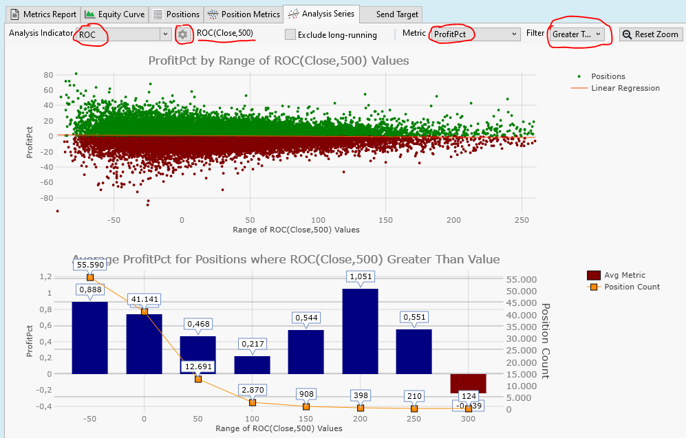
The upper plot is a scatterplot. It shows a dot for each trade. The X-Axis shows the ROC values (A stock's gain after 2 years).
The Y-Axis shows the trade profits of the 1-Month trades.
From the scatter plot there is no obvious relation between past performance (2 years) and future performance (1 month) of each stock.
We need to dig deeper to see any effects. That is what is done in the lower plot.
This plot answers the question: "What if I enter a trade if the ROC is greater than X%?"
On the X-Axis we see this X% limit.
Then there are two Y-Axis.
The left Y-Axis shows the average profit, the blue bars are the average profit of the filtered trades. For examle: If we enter trades if the ROC is greater than 50% the blue bar at position "50" has a height of 0,468%, which is the average profit of all the trades entered if ROC(500) > 50%
The right Y-Axis shows the number of trades, represented by orange dots in the plot.
When our ROC filter gets tighter (from left to right) the number of trades gets smaller.
When the filter is ROC>50% we have only 12691 trades left.
Overall these are sad plots: We choose stocks that have better and better performance in the past 2 years, we get fewer and fewer trades (this is expected) and these trades are worse than average!
We see the well documented mean-reversion effect in action:
A stock, that performed above average in the past tends to perform below average in the future.
This means: Our stock picking is going to be more difficult than expected.
Now, the plot is generated form "ex post" data, i.e after the fact, with performance values from the past. If we want to generate profits as promised by this plot, we need to select stocks that will perform above average in the future.
So one might think: "Let's choose stocks that had (very) good profits in the past, these will certainly perform very good in the future.
Unfortunately this is a perfect example for this famous quote:
QUOTE:
For every complex problem, there is a solution that is clear, simple, and wrong
--- H.L.Mencken
Let me demonstrate this with the tools available in WealthLab. I created a trading strategy that produces mothly trades. It enters a position at the open price of the first day of a month and exits at the first day of the following month.
When run on the data Set "S&P500 Current & Past" (Norgate Data) and the Data Range 2013 - 2024 it produces 71255 trades with an average profit of 1.06%.
Now lets cherry pick only those trades that are entered after a stock rose by more than X% during the last 2 years.
This is best visualized using the "Analysis Series" performance visualizer from WealthLab:
* Make sure you checked the "Analysis Series" performance visualizer in Tools->Preferences->Backtest->Performance Visualizers
* After the strategy has finished go to Backtest Results->Analysis Series
* Choose "ProfitPct" as the "Metric"
* Choose "Greater Than" as a "Filter"
* choose "ROC" as "Analysis Indicator" (this is a legal proxy for CAGR in this case)
* use the "Configure Indicator Parameters" Button (gearwheel icon) to select a period of 500 bars (two years)
* Zoom the top plot a bit to show a meaningful data range
here is the result:
The upper plot is a scatterplot. It shows a dot for each trade. The X-Axis shows the ROC values (A stock's gain after 2 years).
The Y-Axis shows the trade profits of the 1-Month trades.
From the scatter plot there is no obvious relation between past performance (2 years) and future performance (1 month) of each stock.
We need to dig deeper to see any effects. That is what is done in the lower plot.
This plot answers the question: "What if I enter a trade if the ROC is greater than X%?"
On the X-Axis we see this X% limit.
Then there are two Y-Axis.
The left Y-Axis shows the average profit, the blue bars are the average profit of the filtered trades. For examle: If we enter trades if the ROC is greater than 50% the blue bar at position "50" has a height of 0,468%, which is the average profit of all the trades entered if ROC(500) > 50%
The right Y-Axis shows the number of trades, represented by orange dots in the plot.
When our ROC filter gets tighter (from left to right) the number of trades gets smaller.
When the filter is ROC>50% we have only 12691 trades left.
Overall these are sad plots: We choose stocks that have better and better performance in the past 2 years, we get fewer and fewer trades (this is expected) and these trades are worse than average!
We see the well documented mean-reversion effect in action:
A stock, that performed above average in the past tends to perform below average in the future.
This means: Our stock picking is going to be more difficult than expected.
Here is the strategy I used to produce monthly trades:
There are a few additional filters to avoid non-sensical trades if the strategy is run on very large data sets like the Russel 3000.
CODE:
// MonthlyTargets
using WealthLab.Backtest;
using WealthLab.Core;

namespace WealthScript1
{
   public class MyStrategy : UserStrategyBase
   {
      static string[] monthName = {
         "null",
         "January",
         "February",
         "March",
         "April",
         "May",
         "June",
         "July",
         "August",
         "September",
         "October",
         "November",
         "December"
      };

      public MyStrategy()
      {
         Parameter p = AddParameter("NumMonths", ParameterType.Int32, 1, 1, 24, 1);
         p.Hint = "Holding Time, number of months";
      }

      public override void Execute(BarHistory bars, int idx)
      {

         int numMonths = Parameters[0].AsInt;
         if (idx >= bars.Count - 1) return; // Last bar
         if (bars.DateTimes[idx].Month == bars.DateTimes[idx + 1].Month) return; // within month

         if (HasOpenPosition(bars, PositionType.Long))
         {
            foreach (Position p in OpenPositions)
            {
               int barsHeld = idx - p.EntryBar;
               if (barsHeld > numMonths * 21 - 11)
               {
                  ClosePosition(p, OrderType.Market, 0.0, $"End of {monthName[bars.DateTimes[idx].Month]}, #months={numMonths}");
               }
            }
         }
         if (bars.Close[idx] < 5.0) return; // Penny Stocks
         if (bars.Volume[idx] * bars.Close[idx] < 10000.0) return; // Liquidity
         if (bars.Close[idx] > 10000.0) return; // bad

         Transaction t = PlaceTrade(bars, TransactionType.Buy, OrderType.Market, 0.0, $"Start of {monthName[bars.DateTimes[idx + 1].Month]}");
      }
   }
}
There are a few additional filters to avoid non-sensical trades if the strategy is run on very large data sets like the Russel 3000.
@superticker: You said:
Could you please elaborate a bit?
I find it very hard to find stocks (based on past indicator/stat values) that perform reasonable (above benchmark) in the future.
I am prepared to implement any ideas (even involving MathNet calculations) and make them publicly available if something works reasonably well.
QUOTE:
I cherry pick all my datasets for WL.
Could you please elaborate a bit?
I find it very hard to find stocks (based on past indicator/stat values) that perform reasonable (above benchmark) in the future.
I am prepared to implement any ideas (even involving MathNet calculations) and make them publicly available if something works reasonably well.
QUOTE:
How would machine learning fall into this?
I think machine learning is the second step.
The first step is finding a few indicators / statistics / performance measures that predict future performance to a certain degree.
Then you could use machine learning to find an optimal model that combine these inputs/factors/indcators in a perfect way.
QUOTE:
superticker: "I cherry pick all my datasets for WL."
QUOTE:
Could you please elaborate a bit?
Well, it's not a simple process. The Fidelity stock screener (tier 1) is run at the end of every trading day. It's basically looking for stocks that have recently performed well, have high volume, and have some kind of StarMine rating.
The second tier screener runs on WL and basically looks at the polynomial regression results (including R²) for the last ten bars. If the stock passes that, it gets grouped into an incoming dataset.
On weekends, that dataset is tested against all the strategies (Yes, that means fitting strategy parameters with the optimizer.) and presented via WL's Symbol Ranking tool with all the ScoreCard metrics. I sort them by Sharpe Ratio. You can take a look at that ranking at this link. https://www.wealth-lab.com/Discussion/Symbol-Rankings-are-all-the-same-13008#post1
Most of the ScoreCard metrics aren't too helpful, but the Sharpe Ratio is important and the weighted average profit% (WtdAv5ProfitPct) over the last five trades are most useful. For those few stocks that pass muster, I then open up their equity curve for that particular strategy and look it over myself. If the equity curve is positive going over the most recent trades, the stock gets associated with that specific strategy.
---
The right way to do this (as we would do in a publication) would be to run a Cluster Analysis of all the ScoreCard metrics to see which metrics are alike, then follow that with a Factor Analysis to compute composite factor(s) of those ScoreCard metrics that cluster alike. One can then use those composite factors to score the stocks. But I haven't had time to do that.
Probably the best ScoreCard metric is a nonparametric one, but that takes more work to develop.
QUOTE:
We see the well documented mean-reversion effect in action:
A stock, that performed above average in the past tends to perform below average in the future.
This is based on trading solely against the ROC indicator. In practice, our own WL strategies are more scrutinizing than one indicator.
QUOTE:
This means: Our stock picking is going to be more difficult than expected.
I wouldn't stock pick based on a single indicator (like ROC). One really needs to take the candidate stocks and test them against all of one's production strategies, then select the particular stocks that have recently traded well with a specific strategy.
"Recently traded well" should be based on the equity curve itself. The ScoreCard metrics fail to weight the "recently" part, and should only be used as a guide. The ScoreCard metrics that are based on statistical behavior are the most revealing, although all are based on classical, moment-based statistics when they should be based on robust statistics because the random error in these metrics is highly skewed (not normal). Someone needs to update them.
Your Response
Post
Edit Post
Login is required