Is it possible to define different in-sample and out-of-sample periods during optimization?
Rename
Yes:

Ok, thank you very much...but is it possible to specify more than one time period for InSample and Out of Sample and with individual dates?
Example: In Sample 10.10.2002 to 11.10.2007, Out of Sample 12.11.2007 to 05.03.2009, In Sample 06.03.2009 to 20.05.2015, Out of Sample 21.05.2015 to 11.02.2016
Example: In Sample 10.10.2002 to 11.10.2007, Out of Sample 12.11.2007 to 05.03.2009, In Sample 06.03.2009 to 20.05.2015, Out of Sample 21.05.2015 to 11.02.2016
Eugene's answer refers to Walk-Forward optimization.
If you're after IS/OS comparisons during a normal optimization, then you need the finantic.ScoreCard extension. With this extension installed the sequence is as follows:
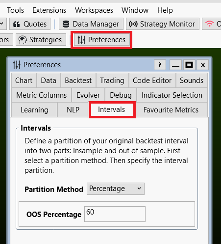
* Define what part of your of your data interval should be "In-sample" (IS) and which part should be "Out-of-Sample" (OS). Choices are percentage of complete interval or a fixed switchover Date. You do this in Preferences->Intervals:
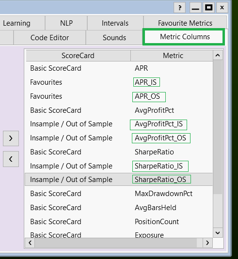
* Then you replace the usual metrics calculated during an optimization with their respective IS/OS versions. You do this in Preferences->Metric Columns:
This has the effect, that during each optimization run not only a performance metric for the complete interval is calculated (Example: APR) but also separate metrics for the IS interval (Example: APR_IS) and the OS interval (Example APR_OS)
If you use an optimizer which can optimize for a specific target metric, you should choose an IS metric here. (Example APR_IS):
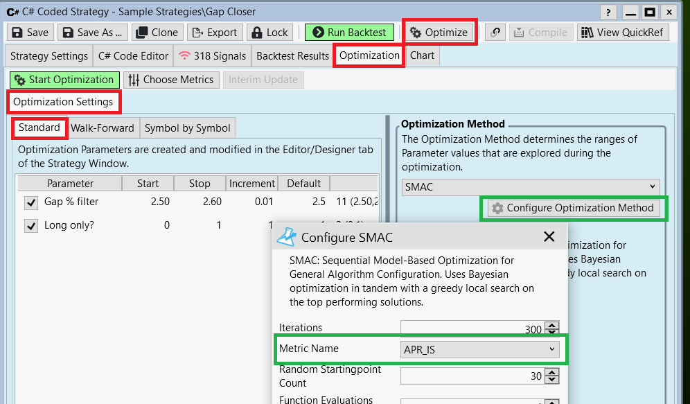
(The whole process works the same for an "naïve" optimizer like Exhaustive)
The optimization results table will now show separate results for IS and OS intervals.
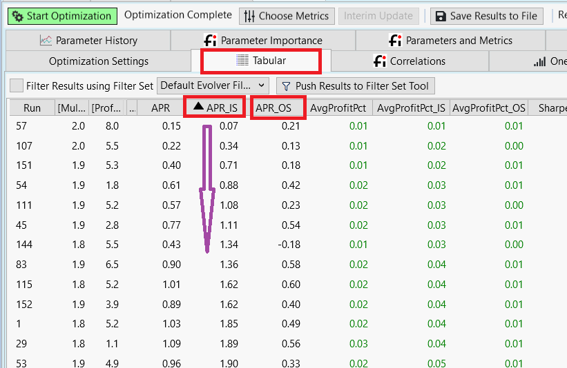
This allows for an exciting possibility: With these results it is possible to determine the point where over-optimization sets in. We sort the APR_IS column for increasing values. Now this column shows how the optimizer finds better and better results.
Now we use a special graphic to visualize the progress of the optimizer. We draw a curve where the IS results get better and better from run to run. (the APR_IS column form the table, blue curve)
Then, in the same graph, we show the OS results for the very same runs. (the APR_OS column, red curve):
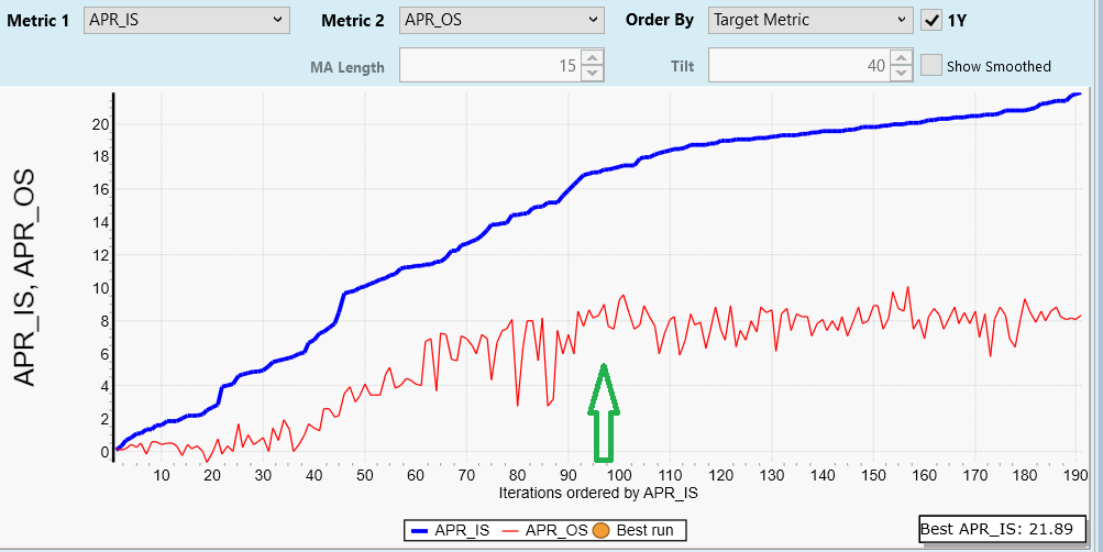
In the left part, the IS and OS results both rise. Then at a certain point (see green arrow) the red curve does not improve any more.
This means: All improvements in the blue curve to the right of the green arrow come from over-optimization.
If you're after IS/OS comparisons during a normal optimization, then you need the finantic.ScoreCard extension. With this extension installed the sequence is as follows:
* Define what part of your of your data interval should be "In-sample" (IS) and which part should be "Out-of-Sample" (OS). Choices are percentage of complete interval or a fixed switchover Date. You do this in Preferences->Intervals:
* Then you replace the usual metrics calculated during an optimization with their respective IS/OS versions. You do this in Preferences->Metric Columns:
This has the effect, that during each optimization run not only a performance metric for the complete interval is calculated (Example: APR) but also separate metrics for the IS interval (Example: APR_IS) and the OS interval (Example APR_OS)
If you use an optimizer which can optimize for a specific target metric, you should choose an IS metric here. (Example APR_IS):
(The whole process works the same for an "naïve" optimizer like Exhaustive)
The optimization results table will now show separate results for IS and OS intervals.
This allows for an exciting possibility: With these results it is possible to determine the point where over-optimization sets in. We sort the APR_IS column for increasing values. Now this column shows how the optimizer finds better and better results.
Now we use a special graphic to visualize the progress of the optimizer. We draw a curve where the IS results get better and better from run to run. (the APR_IS column form the table, blue curve)
Then, in the same graph, we show the OS results for the very same runs. (the APR_OS column, red curve):
In the left part, the IS and OS results both rise. Then at a certain point (see green arrow) the red curve does not improve any more.
This means: All improvements in the blue curve to the right of the green arrow come from over-optimization.
many thanks
What I forgot to mention:
That valuable blue line/red line plot is created by an Optimization Results Visualizer called "Parameters and Metrics" which is part of the finantic.Scorecard extension.
That valuable blue line/red line plot is created by an Optimization Results Visualizer called "Parameters and Metrics" which is part of the finantic.Scorecard extension.
Your Response
Post
Edit Post
Login is required