I really like the By symbol standard tab that shows distribution of profits by symbol. Also very nice PowerPack Contribution metrics: by month and by instrument.
But I'm really lacking distribution by strategy. The only way to roughly understand each strategy's profit is in Profit Curves, but as there are 10+ strategies in my combo it's really hard to compare colors.
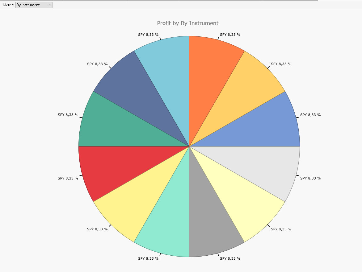
So is it possible to add to Contribution->Metric: By strategy? Or enhance Contribution->Metric: By instrument, so that duplicate instument have strategy names?
Thank you!
But I'm really lacking distribution by strategy. The only way to roughly understand each strategy's profit is in Profit Curves, but as there are 10+ strategies in my combo it's really hard to compare colors.
So is it possible to add to Contribution->Metric: By strategy? Or enhance Contribution->Metric: By instrument, so that duplicate instument have strategy names?
Thank you!
Rename
Tagged this with #FeatureRequest.
I'm implementing this for PowerPack's B48 currently. Note: by design, this visualizer shows a breakdown of either Profit or Loss by chosen metric (instrument, position type etc.) So the upcoming pie chart by Strategy (for MetaStrategies only) will show just one side of the coin. For example, one or two losing strategies in an otherwise profitable MetaStrategy will NOT be included, and vice versa. So don't call this a bug or enter a new request please. ;-)
Sure, Eugene, thank you very much :)
Give it a go :)
https://www.wealth-lab.com/extension/detail/PowerPack#changeLog
Make sure to update to WL8 build 94 first!
https://www.wealth-lab.com/extension/detail/PowerPack#changeLog
Make sure to update to WL8 build 94 first!
Your Response
Post
Edit Post
Login is required